

At first glance, CSS may seem like a very simple language. There’s no need to deal with loops or logic conditions. Just focus on one clear goal: “do it according to the design”. We don’t usually think about simplifying or optimising the code. During code review, we oftentimes don’t pay enough attention to the code itself and instead focus solely on business logic. But many CSS concepts may seem easier to implement than our creative ideas once we become more familiar with those concepts. I think CSS is just like scrum: easy to learn, hard to master.Before you learn about several concepts that will help you take our CSS to the next level, you should find out how browsers render content. Browsers render webpages in 3 steps. The first step is layout calculation – browser determines the relations between elements on a page. This process includes analysing such properties as margins, width, and the content of “display: inline” elements. This is usually a very complex process since each DOM element can influence other elements close to it. Once the exact height and width as well as positions of all tags are known, it’s time for the browser to draw them. Each tag on a page is drawn separately. Browser draws images with height and width calculated during the previous step. The third and final step of the rendering process is composition – all the pieces are combined to create the final appearance of a webpage, taking into account e.g. the “z-index” property.The next time a browser loads the same webpage, it can skip the first step or both the second and first step depending on the changes that occur during use of that page. If the “opacity” value is changed, browser will skip the resource-intensive layout calculation process because opacity does not affect the size of any element and all the elements were already in the right place prior to this change.
Faster loading
Understanding the rendering process will help us create smooth CSS animations. We can also make our webpage load faster. If you deal in website optimization, you have probably heard about including fixed image width and height in <img> tags. If you specify those exact values, browser can reserve space for the image to be loaded later. When you don’t specify those values, browser is forced to render the entire page from scratch after loading the image. What causes this? When an image is loaded, browser receives information about its height and width. If those values change, browser has to recalculate the layout – in other words, go back to the first rendering step. Specifying exact width and height in <img> tags is an interesting idea, but if you choose this method, you lose the ability to create responsive images. However, you can develop other methods of reserving space for images so they are responsive once loaded. Below are two examples using a particular CSS “hacking” trick. Don’t worry, we won’t be hacking NASA or anything like that with this language! It’s just a simple trick to make the browser understand an entry that may seem very difficult to comprehend at first glance. To reserve rectangular space on a page that will maintain image proportions, you must know the width and height ratio. Let’s use a picture that is 660px wide and 264px high as an example. Knowing these dimensions lets us easily calculate (using the following formula: height * 100 / width) that the height is equal to 40% of the width. Once we’ve calculated those proportions, we can write the code:<style>
.img {
width: 100%;
max-width: 660px;
display: inline-block;
}
.img__container {
height: 0px;
padding-bottom: 40%;
}
</style>
<div class="img">
<div class="img_container">
<!-- posiadam 264px wysokości i 660px szerokości -->
</div>
</div>
This entry will make a tag that has styles applied to it scale like an actual image. The whole trick is to use a percentage in the “padding” property. The “%” in “padding” always refers to width. This allows you to reserve sufficient space and enable proportional scaling. So, we’ve created an empty tag with no content. To put an image inside that element, we must set an absolute position or set the image as background of that tag. Let’s see which idea works best in practice!
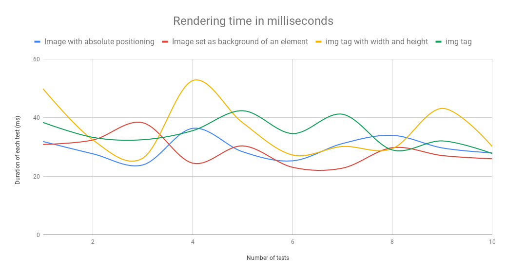
The results of my tests have really surprised me. I measured the time it took to draw and render eight images of different sizes. I also used developer tools to limit the Internet connection speed to fast 3G for the duration of testing. This was meant to force my browser to render parts of images and recalculate the layout after loading only those parts. The padding trick used to reserve space proved the most effective, regardless of whether the image used absolute positioning or was set as tag background. Below you’ll find the average time it took for each solution to work.
Average timesacross 10 testsimg tagimg tag withwidth and heightimage usedas backgroundimage withabsolute positioningdrawing process23,7 ms

26,3 ms

15,2 ms19,3 msrendering process11,0 ms
9,7 ms
13,3 ms10,3 msboth processes34,7 ms
36,0 ms
28,5 ms29,7 ms
Using the image as div background yielded the best overall time. This solution proved the fastest despite offering the slowest rendering time. Rendering includes layout calculation and composition. The most surprising result was the one achieved using the recommended solution – specifying width and height. You’d think this would be the best solution since it skips the layout calculation phase. While that is true – the shortest rendering time is proof enough – the image drawing process was much slower for some reason. Test results show that both percentage-based solutions work quite well. A 1.2 ms difference is so small that we might as well treat is as a statistical error and assume that those two processes are almost the same. After my tests, I can say with full confidence that it’s a good idea to use this trick with each image, whenever possible. I only used 8 images and a few html tags during testing. Despite this small sample size, the differences were as large as 7.5 ms – the more complex the page, the larger the difference. What’s more, you can eliminate the “stacking” effect, making the page load much smoother.
Unruly animations
Phew! We are now done with the first topic. We found out how to create <img> tags that do not slow down the rendering process of a page. The next topic is animations on pages. I really hope that none of you are still using the outdated animation method created by the developers of jQuery and used in its first releases. I also hope that you are familiar with the transition property of CSS. If that’s the case, let’s learn about the “will-change” property that is also related to animations.Let’s go back to rendering for a second. Remember how that goes? The rendering process is done in 3 steps: layout calculation, element rendering, and composition. Once the composition step is finished, most data from the layout calculation step is deleted so it does not bog down the RAM. With will-change, you can choose the elements for which previously calculated values should be saved for later use. If you do this, browser will not delete those values from memory and will be able to react more quickly to animations that require additional calculations, e.g. recalculating the layout.However, will-change is not a universal solution. It takes up memory, so it should not be used for elements that are not being animated at a given time. When optimising, remember the common pitfall of design: “premature optimisation”. will-change can be helpful, but it can also do more harm than good. Adding this property to every single animation on a page might not be the best idea. First and foremost, you must pay attention to what kind of properties you’re animating!Elements are often hidden and shown by changing the display property. When you change this property, the layout of your page will also become different. That’s why rendering always starts with element layout calculation. Using opacity is the best way to achieve smooth animations. When an element is hidden but still located in its designated spot, it can be displayed much more smoothly. The problem with this approach is that elements hidden by adjusting their opacity are still clickable. Fortunately, there is a solution to this issue: a very interesting CSS property called pointer-events. You can set the pointer-events property to “none” when an element is hidden.
CSS selectors
Before rendering the first image of a webpage using CSS, each browser must process HTML and CSS files and link DOM and CSSOM. A page can be rendered using CSS only after those steps are complete. The speed of linking those separate elements is determined mostly by selectors used in CSS files. By knowing the method in which browsers analyse your CSS selectors you can learn to use those elements more efficiently. Contrary to what might seem natural to you, CSS selectors are read right to left. This is due to the relations of numerous HTML tags with many CSS selectors. A more efficient method you can use is to analyse all html tags one by one and check all of their rules. Checking selectors from the end usually lets the browser reject the non-matching ones much more quickly. To write efficient selectors, the last element in each selector should filter out as many HTML tags as possible. An example of a poorly optimised selector is this seemingly innocuous selector often used to teach CSS beginners:ul.menu li a spanListing each element separately like this is a common practice. The worst example of such linking is the use of a very common tag on a page – in this case, it’s “span”. To find all matching tags, browser must first search for all the “span” tags, and then filter out those with “a” tag parents. That could be a lot of elements. Only the third tag, “li”, is likely to help the browser specify most of the “span” tags we want to download. Lastly, we check again if everything is in a “ul” tag with menu class, just to make sure. How can you optimise this selector? The easiest way would be adding a class to the “span” tags. And that’s exactly what we’re going to discuss next.ul.menu li a .menu__spanLet’s also test a simplified selector:.menu__spanWant to see the results? Me too! I used Emmet to create the HTML structure for this test. I wanted the page to have many “a” and “span” elements, but only one “menu” element.html>head+body>((ul.menu>li*6>a>span.menu_span>Lorem2)+(.container>((aside>ul*4>li*7>a>span>Lorem1)+(article>(p*20>span*3>Lorem2)+p*20>Lorem120)))+(.footer>ul*4>li*6>a>span>Lorem2))*50For this test, I have prepared a code that may look like a webpage. There are lots of “span” tags, and many of them have an “a” parent tag. With this structure, many elements we search for at the end of a selector (a span) will require browsers to do additional work. The same HTML code was used in each test. During testing, I measured the speed of the DOMContentLoaded event that is triggered upon linking HTML with CSS. I performed 70 tests for each selector. Unfortunately, all I got was a chart that didn’t really tell me anything.
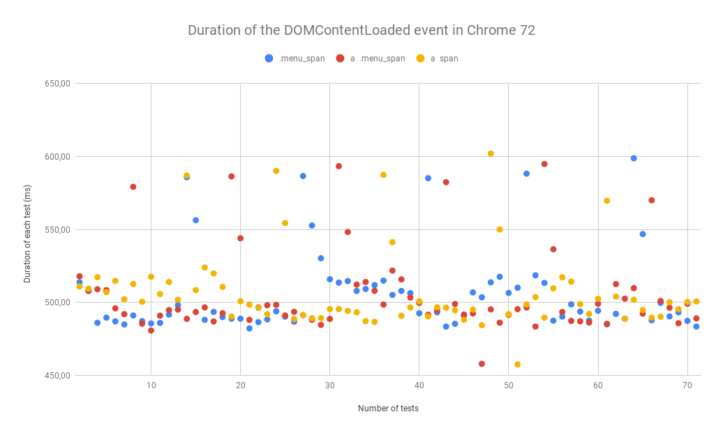
All I could see was that the results were very similar, so I sorted them to be able to determine the winner of this battle. I also performed the tests in Firefox.
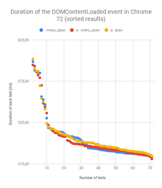
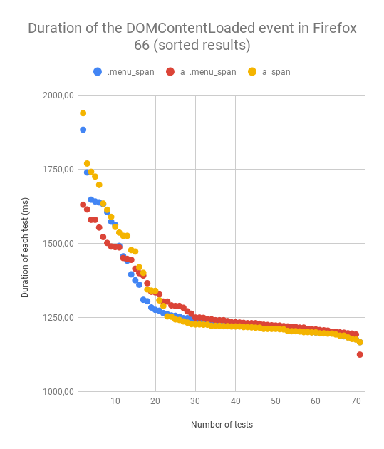
All the results are very similar, so I created a table with average values for each selector.
Averageul.menu li a spanul.menu li a .menu__span.menu__spanChrome 72
507,22 ms
505,09 ms
505,86 msFirefox 66
1306,08 ms
1295,10 ms
1295,59 ms
As you can see, the differences are tiny, but they prove my point. The last element within a selector affects that entire selector’s efficiency. You might be wondering if it’s a good idea to optimise selectors. Of course not! You should not optimise existing selectors in applications. They have an extremely low impact, as evidenced by this large HTML created for the test. And now you might ask, “What do I do with all this knowledge about selectors”? You should avoid badly designed CSS frameworks and use CSS methodologies like BEM. The BEM methodology simplifies CSS code management and makes the selectors more efficient. If you are not familiar with the BEM methodology yet, you should learn about it as soon as possible!https://budzis.pl/Wpisy/Kursy/Optymalizacja-stron/Metodologia-BEM/You should always pay attention to selectors when choosing frameworks. Finally, I did one more test comparing the grids of two CSS frameworks: Bootstrap 4 and Semantic UI. The CSS I used for this test only had the code necessary to create a grid. For this test, I used HTML that could work with two frameworks at the same time. CSS was added in a <style> tag to avoid network-based loading.html>head+body>.grid.container*32>.row.three.column.row*32>.col-lg-2.large-2.columns.column*32The differences were much larger this time.
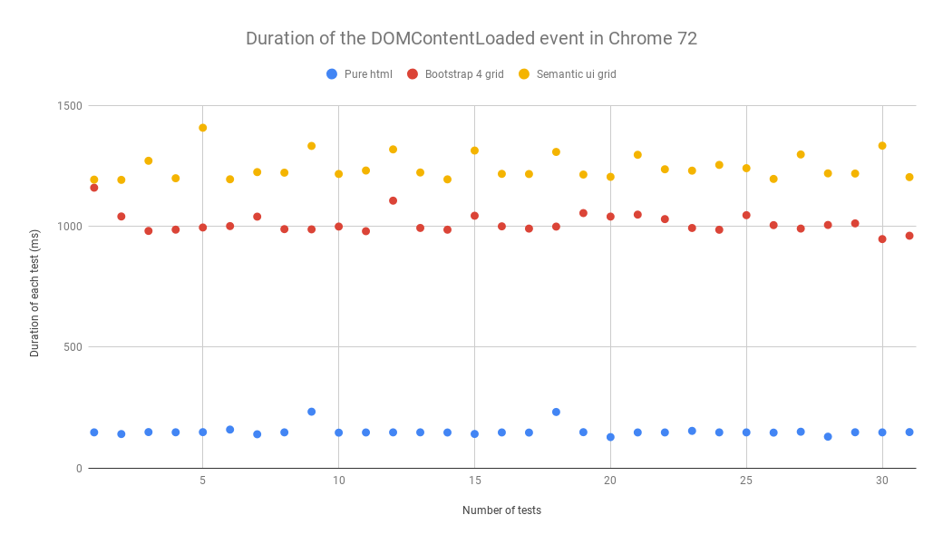
As you can see, Semantic UI can’t hold a candle to Bootstrap. It’s mostly due to it creating selectors based on attribute values that make it impossible to write clean code or optimise CSS selectors. To save a column, Bootstrap uses a .col-3 selector while Semantic uses a [class*="four wide”].column selector. I think that Semantic UI follows an incorrect path that it cannot leave without changing its name. The semantic approach simply does not work with CSS files.
The end
We finally made it to the end! I know, it was a long journey. The article turned out pretty complex. I’m glad that it was interesting enough for you to make it this far! To sum the whole article up, just remember these 3 things.First: always reserve space for images on a webpage. You cut rendering time and make the whole page look well-organised and much more appealing. Thanks to reserved space, users can safely click links without worrying about something suddenly shifting on the webpage and them clicking the wrong element.Second: avoid premature optimisation. Don’t use properties like “will-change” unless they are absolutely necessary.Third: when writing CSS, use your methodology of choice to create efficient selectors and reusable CSS code. By using the right methodology – like BEM – you can avoid writing redundant code. Thanks for reading! Leave any questions you have about this article in the comments. I’ll be happy to answer them for you.


