World of prototyping tools is on fire right now. There are so many different apps and possibilities that you can’t ignore it any more. Companies outdo each other in creating features that will make it even easier to show rather than tell. You know that case. You’re trying to explain something with words but realizing that it’s so much simpler to sketch your ideas on a whiteboard or a piece of paper. It saves your time and simplifies your message. That’s prototyping.
Having prototyping as a step in your designing process helps you validate your ideas, explain them to others or test already existing concepts with real customers. It doesn’t matter if this is your new Android app or a watering can. If you look at the design as a form of communication, your end product is like a well-crafted stand up comedy piece that makes everyone laugh to tears. Prototypes on the other hand, are the new jokes that you tested on your friends at last Friday’s party. Some of them were corny but few after some polishing will do. And that’s prototyping.
So, what kind of tool you should use? It pretty much depends on what effect you want to achieve and what you want to do. Choosing a right tool for your job is crucial for better communication with a team of developers or a client. It’s also important to choose a method that will suit the complexity of your problem – there is no need to build a whole screen if you want to show a simple hover state of the button. Don’t use a sledgehammer to crack a nut.
In order to compare the tools we need to have some criteria. I’ve checked them for several factors:
Ease of use
How hard is it to learn the tool. Is it natural and fast or does it require some time?
Collaboration
This is a core value of prototyping. How can you collaborate with your team or a client? Leaving comments, sharing links or hosting your prototypes in a cloud with an ability to download them for offline testing – different options for different situations.
Fidelity
Does your prototype feel like a real thing or look like quickly-made wireframes just to show the idea? High fidelity prototypes are preferred when testing on users, they act like the end products so people instead of focusing on the imperfections of the prototype can concentrate on the flow or features they’re testing. Low fidelity is good for testing concepts without unnecessary attention to details.
Ecosystem
How good the tool suits your workflow? Is it smooth like butter or a pain in the neck. This one is really important, there is nothing worse than a tool stopping you from getting that nail hammered.
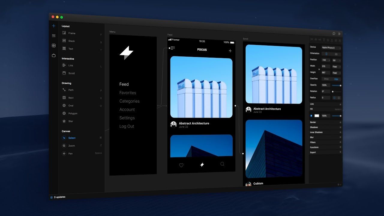
Framer X
Framer is on a market for a while now. The predecessor – Framer Studio, was a workhorse for creating advanced prototypes with complex interactions like working inputs or access to device sensors. It had one downside, it required coding skills using CoffeeScript.
Framer X – the newest version, is also a powerful tool, but the entry threshold is much lower. Now you are able to do the same advanced prototypes as before with only a few points and clicks. You get the power of code without actually knowing how to code. Fully customizable page transitions, scroll components or swipeable UI elements are extremely easy to create, they are responsive and fast. But if you need to sprinkle some extra magic on your prototypes you get a store full of code components written in React. From YouTube players, UI kits, currency converter to map components for implementing interactive maps into your designs. If you know React, you can create your own components and use them freely in your work or share them with others. And what is even better, you’re able to handle the code to your developer who can use it in his build. So no more fights or misunderstandings in this relationship.
Let’s face it. Sketch is the number one when it comes to static designs, but it’s not ideal. Because designers handle off their products as images, developers need to translate them into code, either using InVision or Zeplin. The idea of Framer X is to allow designers to own more of the process and thanks to that be even more connected with the product. They can create components ready to reuse by developers without losing anything in translation.

Ease of use
If you are familiar with Sketch than switching to Framer X is smooth and painless. The main difference in creating a layout is that you use frames instead of groups. Frames acts like na HTML containers, they wrap a content inside invisible boxes which are easy to manipulate, style, resize, etc. Framer X has also some powerful features like Stacks. With Stacks, it’s really simple to create customizable lists and tables with automated distribution and alignment, which is extremely handy.
However, if you want to create more advanced components, you need at least some React basics. This can scare off some designers, especially those from the “Designers shouldn’t code” camp.
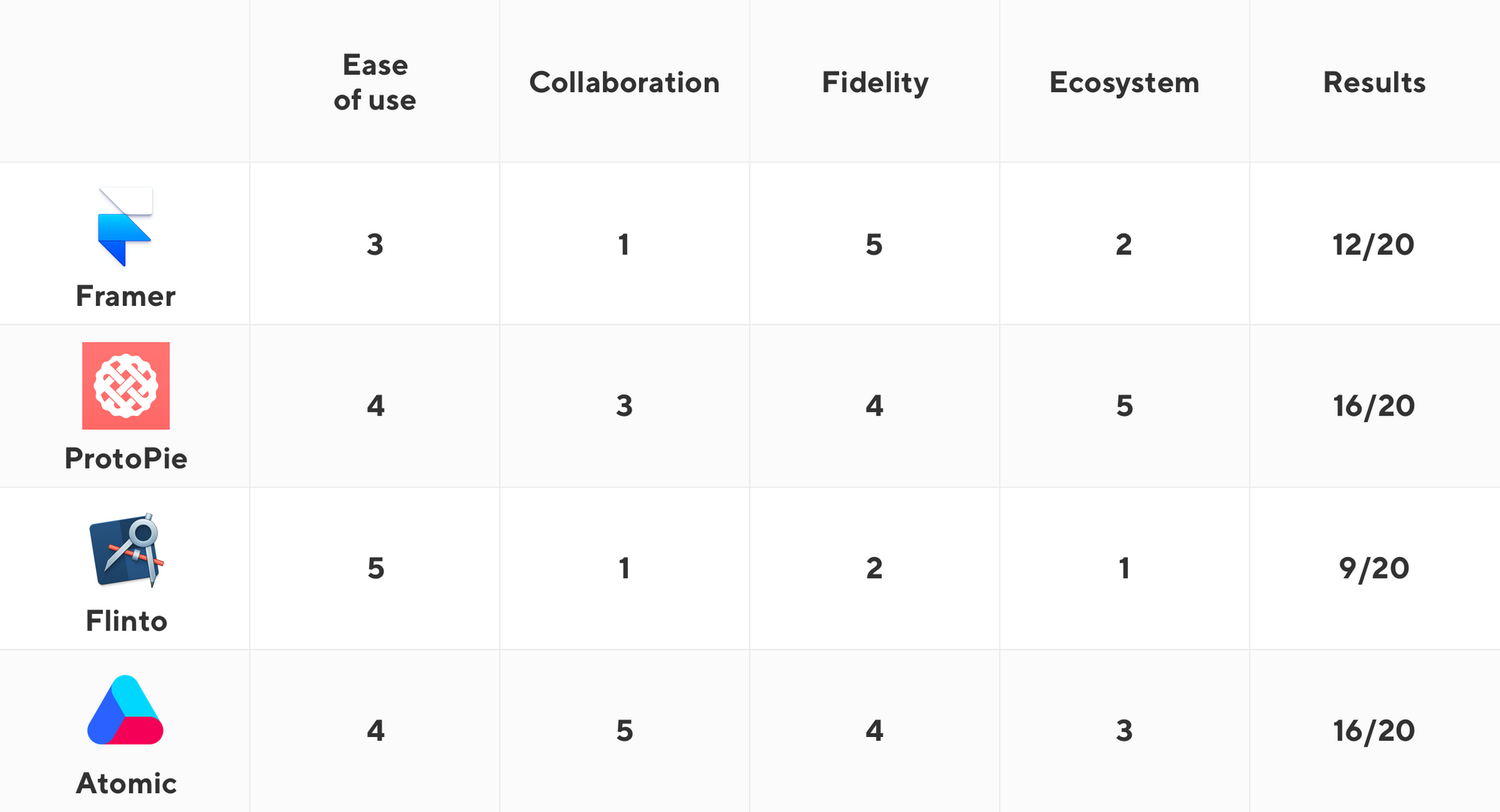
So on our scale of ease of use, Framer X gets three stars out of five.
★★★☆☆
Collaboration
This point of Framer X is unfortunately bad. There is actually no way to hand-off the project to the client or developer, unless you send them an open file. And that’s a bummer.
Framer Studio had this fantastic feature of uploading your prototype to the cloud and accessing it from anywhere. You had also a possibility to download it and use it offline. Framer X has none of those things. You can still generate the share link but it will automatically become inaccessible once your project is closed or if you stop the live preview manually. And this is insane.
I’m pretty sure that the Framer team will work it out, but for now we need to give only one start out of five in collaboration. Seriously, Framer!
★☆☆☆☆
Fidelity
This is where Framer will overcompensate the loss of points. Creating hi-fi prototypes has never been easier. Built-in store with code components is a brilliant idea and it will make Framer stand out for a while. Prototyping with Framer X brings designers a little bit closer to the Holy Grail of product design – UI Component Design Systems. Brands like Airbnb or Shopify are already using components to create consistent products across all possible platforms.
So here we are happy to give five stars out of five. Good job.
★★★★★
Ecosystem
Last but not least – the ecosystem. Framer is available only on Macs but we don’t blame them for that. On their website, they claims that importing Sketch artboards into Framer is simple and all you need to do is to copy and paste. However, we noticed some difficulties and the imported artboards were incomplete. But even if everything worked correctly, having only one (imperfect) import option for Sketch files is pretty limiting and there is no support for other software, so here we also have to lower our score to only two stars out of five.
★★☆☆☆
Overall verdict is 11/20.
ProtoPie
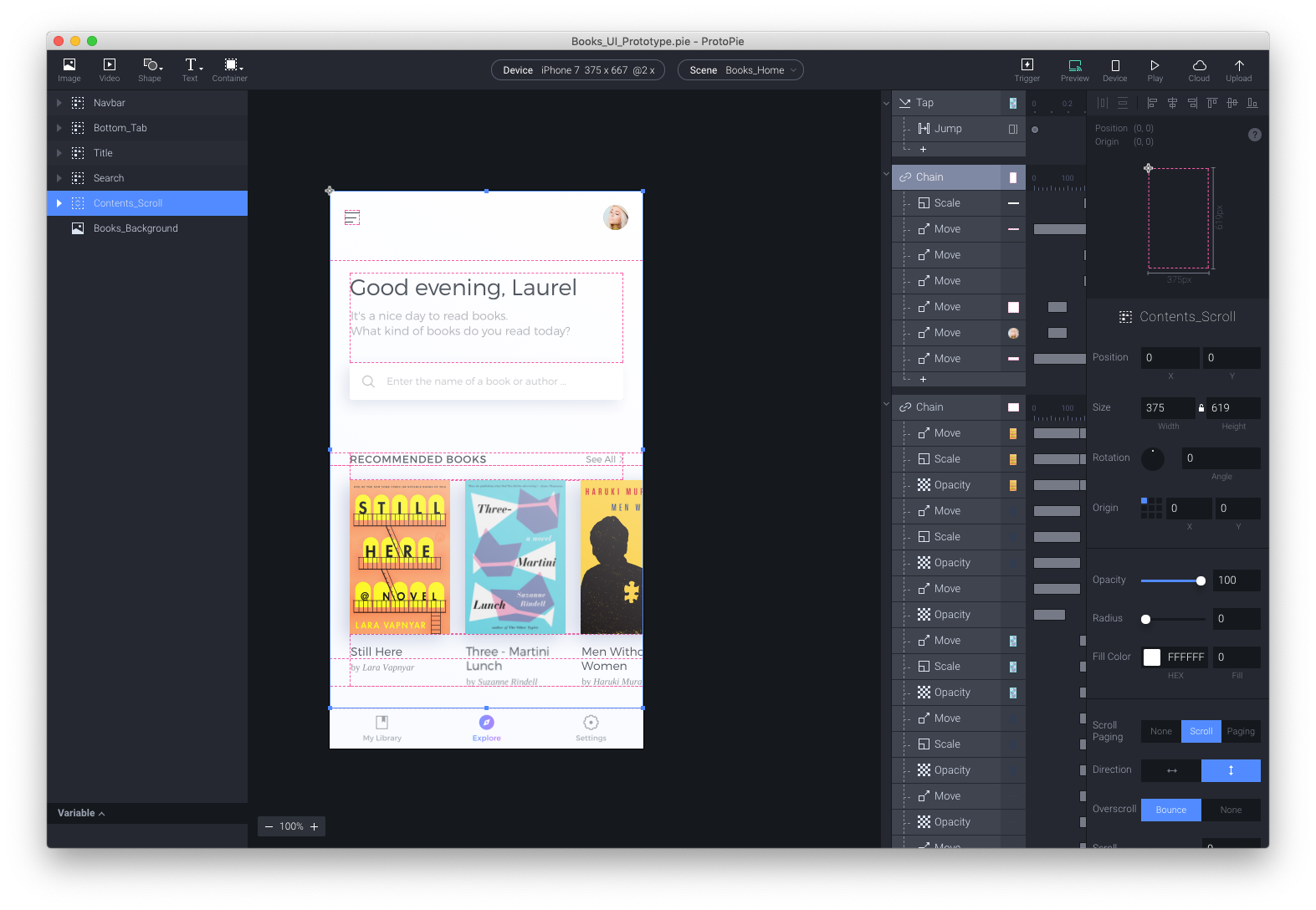
ProtoPie is a fairly young product, but in this dynamic environment having something like a year and a half feels already old. ProtoPie is pretty similar to the Framer X in a way that both companies noticed the aversion of designers to write code. So they started looking for solutions to bridge the gap and ProtoPie came with the answer. They’ve created a tool based on Object, Trigger, and Response. It basically simplifies the interaction to those 3 stages. You have a login button, user taps it and the welcome screen is displayed. With that you are able to build very advanced prototypes by using a plethora of triggers (basics, conditional and sensor). It’s a lot of clicking but the results are surpassingly great.

Ease of use
This one isn’t complicated, but first moments with the tool can be confusing. However, there are a bunch of tutorials so you can get familiar with the interface as well as all the features and start prototyping your designs. You also don’t need to learn code. Everything what could be done with code you can create using triggers and responses. ProtoPie supports multi-touch gestures and a variety of built-in smartphone sensors to design prototypes which act like real apps.
Extensive online documentation makes it easy to learn and prototype even advanced interactions. Unfortunately, it’s not intuitive at first look so the final score in this category is four out of five.
★★★★☆
Collaboration
You are able to preview your prototypes on your phone using a Wi-Fi or USB connection and you can even save the prototype locally and test it offline. But there is more than that. Upload your work to the cloud and share the link with a client or team members so they can interact with it on both desktop and mobile devices. Unfortunately, there is no way to leave comments and hand-off your work to developers, for example. But still it’s a solid performance and that’s why we need to give it three out of five for its collaboration features.
★★★☆☆
Fidelity
ProtoPie gives you really powerful features. Creating really sophisticated prototypes isn’t that complicated and everyone who works professionally as a product designer will get it pretty quickly. The end results are fantastic: from micro interaction to bigger and more complex prototypes. But comparing to Framer X, the number of things you can create in ProtoPie is limited because you can’t import some code components. It’s a solid four out of five stars!
★★★★☆
Ecosystem
ProtoPie can run on Mac and Windows. You can import Sketch and Adobe XD files (also available on Windows) and it works perfectly. You get multiple ways to add files, artboards or even single layers. ProtoPie Player for smartphones covers iPhones and Android devices so you get almost everything you could possibly need. And lastly, I want to mention the Bridge feature which allows you to create interaction that involve communication between multiple devices, such as chatting or transferring money — which is bonkers. Well deserved five stars!
★★★★★
Final score for ProtoPie is an impressive 16/20.
If you need to create advanced prototypes fairly quickly and than share them with clients or test with users – ProtoPie is the way to go.
Flinto
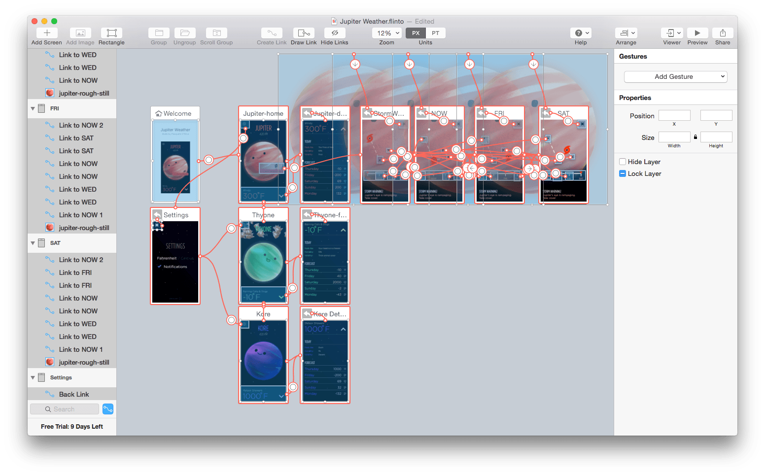
This app is well known for a while now, but you certainly can tell that it has some problems with catching a breath in the race with competitors. It gives you the basics and it’s intuitive for beginners. You can create extensive and complex flows as well as small interactions. Flinto does not support any coding and it hasn’t got any timeline,so if it’s your cup of tea, this tool is definitely for you.

Ease of use
There is no learning curve here. All you need to do is to understand what you can achieve and how. Creating interactions is easy: you choose the object or an artboard and add links or gestures. You can edit the transition, add sounds or adjust the timing and that’s it. You’re done. There are many tutorials available online and on Flinto’s website you’ll find documentation explaining how to create your prototypes. No coding required. Five stars out of five.
★★★★★
Collaboration
Flinto allows you to preview your work on the mobile device, but only on iOS. If your Mac and iPhone are connected to the same network, you are able to interact with your designs live. Unfortunately, sharing options are limited. There is no sharing link or any way to hand-off your work to developers or a client. You can record the preview window and share a video file or upload it directly to Dribbble. But it’s not a convenient method to share your prototypes and this is a real downside of this tool. One sad star.
★☆☆☆☆
Fidelity
Flinto is good for basics, but if you’re looking for advanced features like interactive inputs or video players you won’t find it here. Nonetheless, Flinto does an excellent job with reviving your static design from Sketch. The only limitation are your skills and imagination. Two stars out of five.
★★☆☆☆
Ecosystem
Flinto has its limitations. It works only on Macs and the preview app is only available for iOS devices. You can import only Sketch files or create design inside Flinto — but it’s a terrible idea. One star.
★☆☆☆☆
Final result – 9/20.
With Flinto what you see is what you get. If you want to just link your screens and add some extra interactions and animation to show it to your team or get some Dribbble love, Flinto will work well.
Atomic
Compared to others, Atomic is purely browser-based. I personally prefer the native apps but thanks to its nature Atomic give you strong collaboration options like working remotely with your team on the same project. It also has a nice dark interface which feels pro.

Ease of use
Atomic has a really cool onboarding: instead of reading through the documentation, you need to complete several tasks and those are very helpful. You can create almost everything using a very intuitive interface, prepare advanced animations or even embed reusable components. Overall four stars out of five.
★★★★☆
Collaboration
When it comes to collaboration, Atomic takes the lead. You can invite your teammates and design on the same project at the same time (just like in Figma). After the job is done, sharing a link or adding comments is super easy. You can also create shareable libraries similar to Sketch and share them with teammates so you all have one source of truth. This is crucial for designing responsive products for different platforms. Five starts for Atomic here.
★★★★★
Fidelity
Designing apps with different gestures, form events, advanced transitions or even keyboard events (using arrows or different keys) is super easy and it feels very real. You can also combine interactions with little animations to achieve more realism. Comparing Atomic to the other runners-up, you can accomplish similar results so it’s pretty impressive for a browser-based app. Four stars!
★★★★☆
Ecosystem
You can use Atomic in your browser so your operating system doesn’t matter. Although, at the time of writing, you are only able to import designs from Sketch, so unless you want to create your prototype directly in Atomic, you are limited to Mac OS — three stars.
★★★☆☆
Final result is 16/20.
If you don’t mind prototyping in your browser, this is really a powerful tool for the entire team. The collaboration features are very handy, especially in bigger or remote teams.
Summary

After all, it’s up to you what tool you choose. It depends on what you need it for, what kind of software fits your workflow the most, or simply what kind of operating system you use. We hope that this short guide has helped you narrow the choices. If you have any questions, don’t hesitate to ask us in the comment section below.


